city rebrand
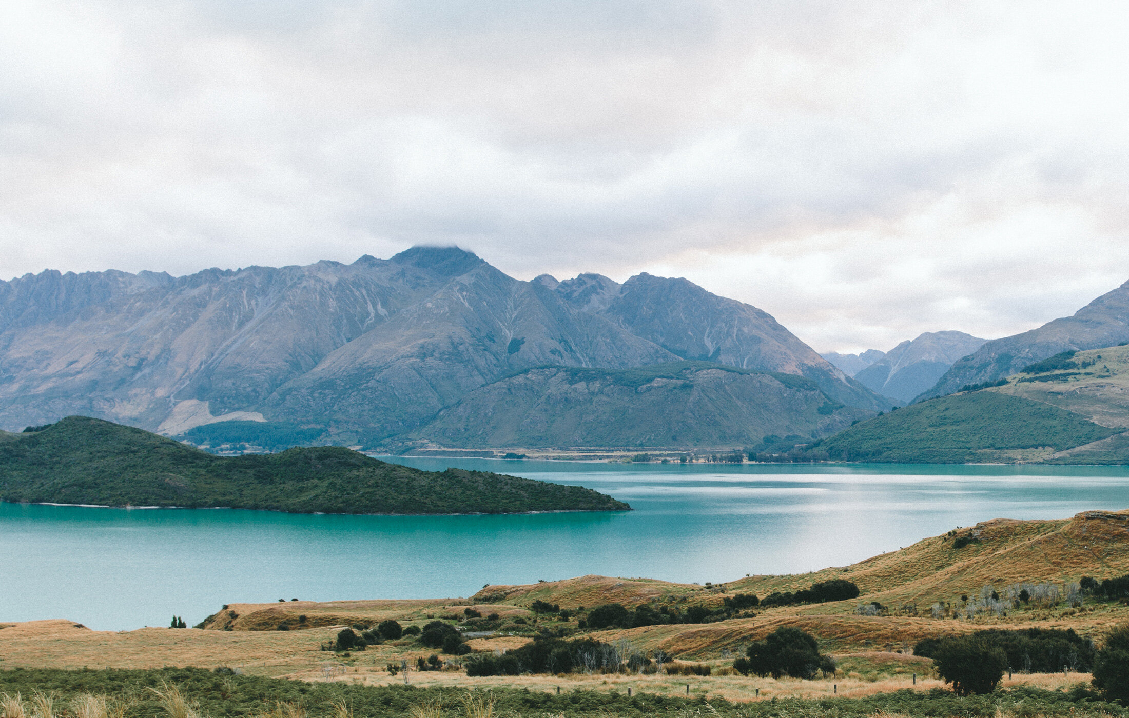
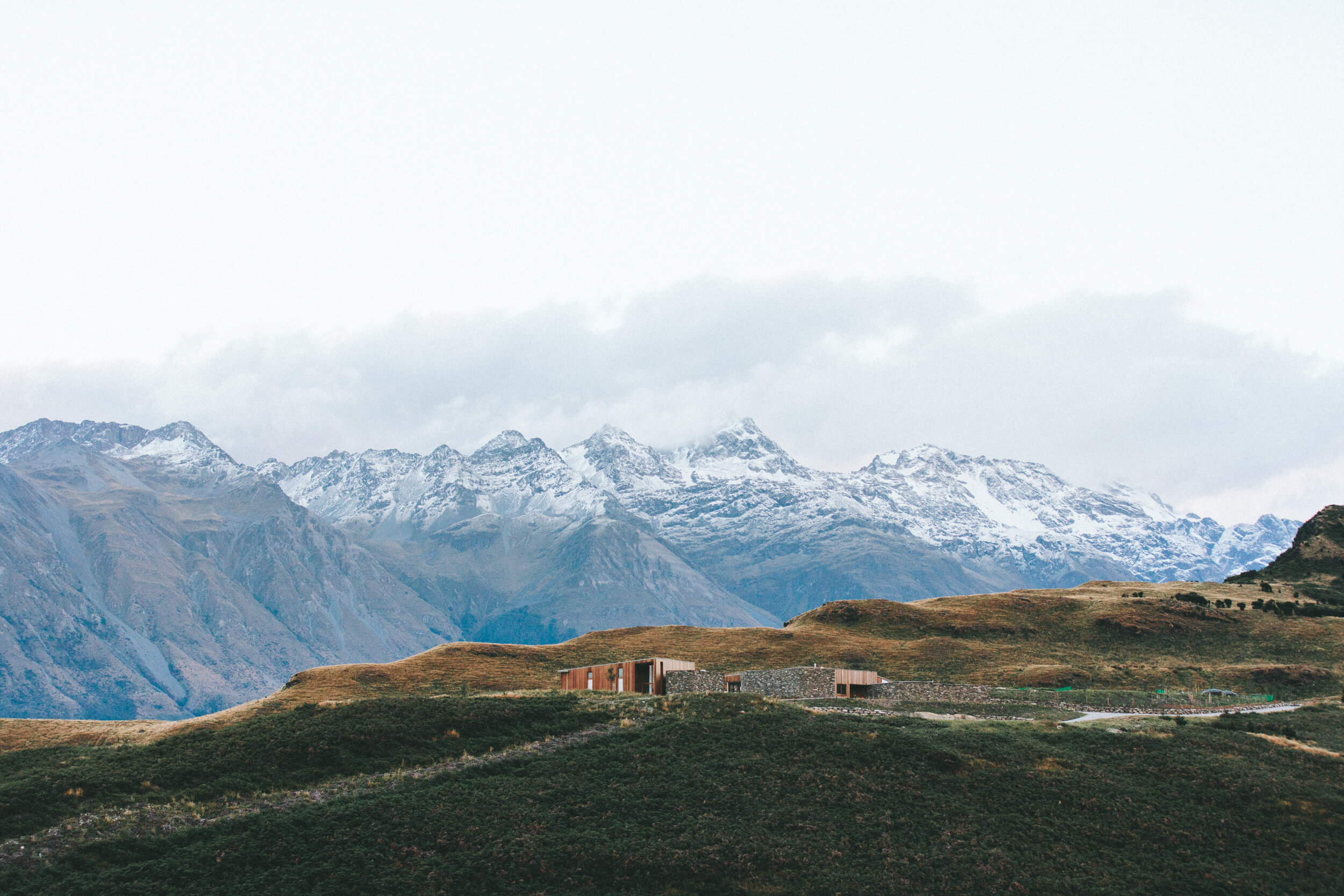
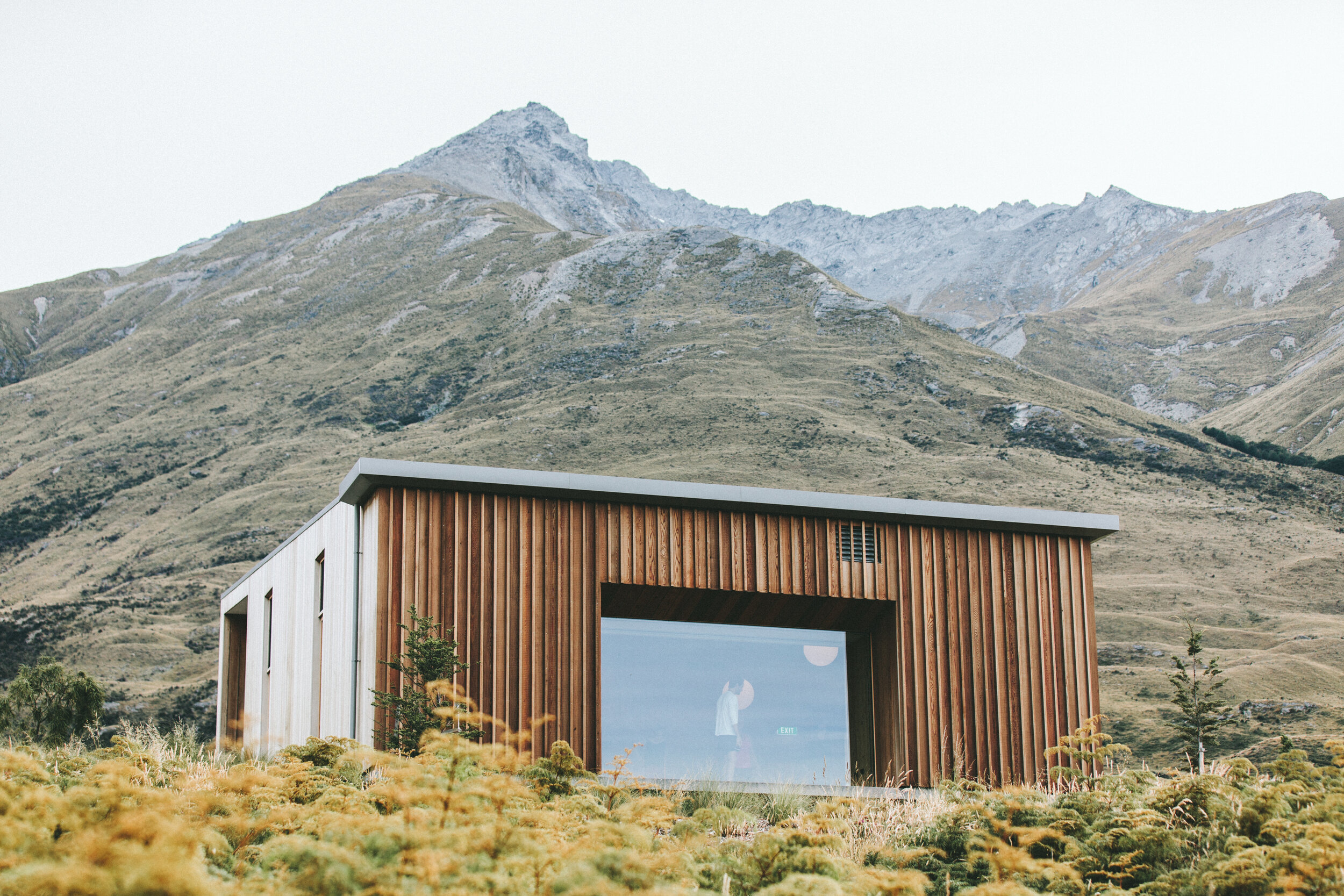
AngelFire, New Mexico, is a small town full of family fun and rich culture. The town is defined by its tourist attractions and outdoor activities for all ages. When designing for a town such as this, it is especially important to take account not only its history but also what makes it stand out. The AngelFire main logo is a mountain made of wings with a blue sun rising behind it, the soft curves of the wings, in combination with the cool blue, create a sense of welcome and intrigue. The color combinations are a combination of bright and friendly colors, such as yellow and red. The playful primaries are welcoming to young families and are anything but dull. The patterning was created through a combination of the winged mountain asset in the main logo, and the combination of these is subtle but still uniform when combined with colors in the brand guide. Grouping and hierarchy were used intentionally on the inside of the brochure. By aligning photos and text while organising them into specific groups, there is a clear hierarchy of important vs. non-important information. The font choices are bold but not overpowering, and the subtle curves of the head font complement the curves in the logo. The sans-serif fonts don't overpower or distract from the information in the text. Through thorough analysis of AngelFires' demographic and best attractions, I was able to create a brand that not only reflects their community but is an organized and balanced, and cohesive brand that is attractive to a wide audience.
The purpose of this design project was to fully understand the importance of developing not only a logo, but a whole brand identity. A design is only valuable if it can be paired with colors and textures that complement each other and create visual interest. This was an exercise in consistency. Having to be intentional about where to place colors and graphics was a difficult decision we had to make as a professional designer, and this was apparent in this project. A difficulty in this design process was definitely deciding how to use the space given on the inside of the brochure. This project came with a lot of freedom come with a lot of responsibility, which was a struggle. As a designer who likes direct instructions, this freedom gave me some stress. Though it was a challenge, I feel that it helped me grow my decision-making skills. To finish, this project not only was a test of our discernment as designers, but also allowed us the freedom to explore and design more freely.


research


brand guide

logos

